Retail Interior | Alessi Flagship Store,New York, USA | Asymptote Architecture |

LOCATION: New York, USA
SIZE: 2,750 sq. ft.
DATE: 2006

The Alessi Flagship Store at 130 Greene Street in SoHo opened to the public in September 2006. Commissioned to create a new identity for the Alessi brand, Asymptote designed not only the store’s interior architecture, but also all of its graphic elements from wall graphics to packaging to a unique modular display system. The store also features an espresso bar and gallery/exhibition area that expands the conventional retail program. In 2007 the store was named Travel + Leisure magazine’s Best Retail Space and received an AIA New York Chapter Design Award.

CLIENT: the Alessi
ARCHITECT: Asymptote Architecture
CONSULTANTS:
STRUCTURAL ENGINEER: Robert Silman Associates
MEP ENGINEER: Kam Chiu Associates
LIGHTING CONSULTANT: Tillotson Design Associates
CONTRACTOR: Fountainhead Construction
More pictures of the interior at Asymptote Architecture

Hotel Interior | Garonga safari Camp

The accommodation at Garonga Safari Camp reflects the surroundings of the bush's textured earthy colours and clean lines have been incorporated with fine linen to ensure pure comfort, a tempting place to lie and meditate for hours.
The Tented Rooms are situated overlooking a dry riverbed - each with a wooden deck complete with hammock that commands spectacular views. The rooms are light, airy and spacious with large, draped beds. In addition to the indoor shower, there is an outdoor shower, providing the perfect link between the luxury of the suite and the allure of Mother Nature......more

Retail Interior | Derek Lam New York | SANAA


The mere thought of a high-profile architect designing a shop for a well-known fashion designer raises the old question: Will the container dominate the contained—i.e., the clothes? After all, artists often complain about new architecturally splashy museums overwhelming exhibited works. Nevertheless, fashion seems to hold its own: In his Calvin Klein store in New York City, Minimalist architect John Pawson created a hushed, monumentally Modern citadel for sculpturally austere garments where both contents and surroundings meet in perfect accord. And despite Rem Koolhaas’s rowdy romp through two levels of the Prada store in the SoHo neighborhood of New York City, the interior’s theatrical design-as-destination encourages curious throngs to peruse the equally provocative jolie-laide items on display.....more

Retail Interior | Surefoot New York | Los Angeles Design Group

Design Principals: Claus Benjamin Freyinger, Andrew Holder
Project Team: Noah Rubin, Jesus Aguilar, Molly Hunker
Type: Tenant Improvement
Location: New York, New York
Year: 2008
Status: Realized

Client Brief
Surefoot's design problem turns on an issue of legibility: They sell a custom fitting process that is unique to the industry, but the store is stocked with rows of intensively patterned and colored boots from immediately recognizable global brands. How can an intangible process supersede or visually insinuate itself into the slick glamour of an industrial design object? The diffusion of the custom-fitting process compounds this design problem; it occurs in a series of small episodes that are not immediately legible as having anything to do with skiing or footwear. In order to fit a boot, Surefoot uses a digital scanner to create a topographic map of the customer's foot. This map is sent to a computer-controlled mill that fabricates an orthotic insert. The process is completed by injecting rapid-hardening foam into the liner of a boot while the customer stands on a canted platform designed to simulate the position and resultant stresses of the foot and ankle against the ski boot while skiing. Uninitiated customers need a spatial system to guide them through the custom fitting process. This process is unavoidably scattered through the store but also part of a coherent whole and a recognizable brand.....more here

Gallery Interior | New Galerie BSL | Paris | Néonata

Opened in Paris' Marais district this May, Galerie BSL will provide space for confrontation and conversation among one-off and limited edition design-art pieces, ranging from jewellery and fashion to furniture and lighting.

Béatrice Saint-Laurent, a former executive at the French Ministry of Culture, gave her name to the gallery and will stock pieces by established stars like Gae Aulenti, Joe Colombo and Martin Grant, as well as newcomers and material experimenters like Nacho Carbonell and Djim Berger.

Saint-Laurent wanted a space that would encourage cross-pollination - between disciplines, periods and modes of expression. She got it in the ribbon-like interior designed by architect Noé Duchaufour-Lawrance of Néonata, whose white Corian envelope was the first object of the collection and lends homogeneity to widely varying pieces.

'I have designed an object which enlarges the perspectives of the space, creates different atmospheres in a unique body and adds rhythm and movement to the gallery,' he explains. With this single gesture, visible from the kerb, the BSL's sculptural shell declares Saint-Laurent's intention to make grand statements.
More of the interior here

Corporate Interior | Coca Cola FEMSA Training Center | ROW Studio


To maintain its leadership in the soft drinks market Coca Cola FEMSA invests significant time and resources in training their employees. This ranges from executive level to dealers and distributors who are the basis of the production chain of the company to be responsible for the orders, the proper disposition of the goods and to represent a personal level the image of the company before the customers. As part of the development of training programs human resources management of the company raises the goal of achieving that in addition to formal courses that all employees receive generate a culture of self training, for which they face the need to create attractive enough spaces where staff can relax and view courses, textbooks, audio books, educational programs and other resources during their free time. With this goal in mind Grissel team led by Brenda González Aguilar, Manager of Training and Ramon Gorbea Chávez, Project Leader, request design proposals from several vendors and after a long and arduous process of evaluating the proposed ROW chosen because Studi originality and quality.
The first room called Area C (C for Coca Cola, Training, Quality, Commitment and Creativity) is located in Mixcoac Distribution Center in the south west of Mexico City. The program includes three individual rooms that can bind to common or separate activities for different uses, a media library, space for snacks, a souvenir shop, facilities for computer equipment and areas of storage. There was also a requirement of the project include any picture of the different brands of Coca Cola FEMSA and to strengthen the campaign of company values in space......more of this interior here

Retail Interior | Jewelery Shop-D Jewelery | Vaillo + Irigaray | Navarra, Spain

Project: D Jewelry
Designer: Irigaray Vaill + Vaill Antonio Daniel, Juan Huarte Irigaray
Project Director: Daniel Galar Irurre
Location: Navarra, Spain
Building Area: 30m2
Project: March 2006
Construction: December 2007
Lighting: Anton Aman - ALS LIGHTING
Prizes: First Prize. Interior FAD'08 ,First Prize. Design Award Chamber of Commerce
Photo: José Manuel Cutillas

It is intended that access to that space and the search for valuable object becomes a magical and exciting journey across the threshold of mysterious jeweler. It's not about buying jewelry ... on one hand access to a ceremony: the ritual of finding a little treasure unknown (there are resonances plays, some treatments of the dome reminiscent of the dark curtains, lighting and set designer ).
Geometry: the box is formed by twin opposing two extruded sections, the upper dark, matte, light and vibrant interior and silver, shiny, heavy and rigid.

The dark is generated by an asymmetric inverted U, which generates a way to vault a section extruded, thus forming the roof and sides (asymmetric): presents a reading of drapery-curtain mysteriously folded.

The other dihedral forms- the floor and furniture behind the counter lateral central, forming an L lying, is generated as a folded surface wear, bright and deep.
More at arquitour

Educational Interior | Toni Stabile Student Center | Graduate School of Journalism | Columbia University New York | Marble Fairbanks

This project is an alternative configuration for the public spaces of the Graduate School of Journalism and an addition to the building that sensitively responds to the McKim, Mead, & White context. Included in the project are spaces for the Journalism Library, the offices of the Columbia Journalism Review, assorted faculty and administrative offices, and classroom space. Central to the proposal is the introduction of several new spaces to serve as a social and intellectual center for the School: a multipurpose “social hub” for student-faculty interaction as well as larger meetings with visitors to the school, and a more informal student lounge space and cafe.
The social hub accommodates a diverse range of programs: study space for students in between classes, meeting space for students and faculty, informal presentation space for visitors from the journalism industry, and other such communal event spaces for the Journalism School. The cafe/lounge is intended to be a louder, more informal space for the School’s students, complete with plasma screens and LED signage that will broadcast the news to patrons. Its site at the formerly outdoor space between Journalism and Furnald allows it to engage the campus environment while also remaining within the School of Journalism. A transparent glass structure is proposed to give the School a more active presence on its entry plaza.
More at Marble Fairbanks's

Exhibition | Donor Hall Research Study Installation | New York, USA | INABA


Research Study, Installation
160 SM
New York, USA
New Museum
with C-Lab

Cultural philanthropy is an expansive field that offers many distinct conceptions of what constitutes ‘culture’ and what purposes it serves. Culture can be a form of enlightenment, entertainment, politics, and even a weapon. The diverse forms of cultural donations reveal a multitude of conceptions about its value and purposes.
Donor Hall at the New Museum provides a picture of global giving, and raises the question of who are the constituencies of cultural philanthropy and what are the specific relations that are constructed between cultural givers and the audiences that they benefit. Using publicly available information about contributions to arts and culture around the world, drawn from sources such as tax filings, corporate annual reports, newspapers and research papers, Donor Hall indicates the contours of global generosity.
The installation arranges organizations and individual donors into categories ranging from national governments to private foundations, media conglomerates to populist movements. The categories do not suggest that a common ideological position is advanced or that the givers share a motive for cultural investment, but rather they allow the viewer to read and interpret the various modes of giving that the donors practice. The categories provide a cross-section of global philanthropy and the many forms that it takes, grouping the givers as broadly as possible by the areas of cultural, political, and/or economic activity in which they operate. Despite their different missions, what unites these groups is an evident belief in the value and power of culture and a desire to use their resources for its support.
The categories of donors are arranged as pie charts and overlaid onto large-scale photographs of actual pies and other foods, a whimsical gesture or parody of the ruthlessness of statistical representations. The entire surface consists of a ‘micro-text’ of quotes from world literature, providing a wide range of commentary on gifts and generosity. A menagerie of cartoon animals, symbolizing prosperity and good fortune in various cultural traditions, frolics among the food and data.
More at INABA's

Retail Interior | O2 Dublin Brand Experience | Ireland, Dublin | JPDA

The O2 Dublin Brand Experience, designed by Jordan Parnass Digital Architecture, opened on December 16th following an €80 million redevelopment of Dublin's historic venue formerly known as the Point Theatre. The venue pampers O2 customers within fantastical themed environments including the Blue Room, Indigo Lounge, and Concierge entry experience. The spaces elevate the design of venue bars and other audience amenities to another level.
The Project included a series of hospitality spaces and customer touchpoints throughout the venue, including:

Concierge – an exclusive entry experience, featuring personalized concierge service provided to O2 customers while bathed in a celestial lighting installation.

Blue Room – a VIP Bar where O2 customers can escape the concessions queues and enjoy a drink while floating above the crowd in translucent glowing ‘bubble snugs,’ bubble-like seating booths hovering implausibly amidst the century-old stone walls.

Indigo Lounge – a top floor VVIP lounge with panoramic views of the city and docklands for special invite-only guests.
The new entertainment venue, sponsored by O2, opened to the public last month, hosting sold out audiences for Kings of Leon and Coldplay. The building, a repurposed shipping depot from the 1880’s, has been refurbished to host concerts with a capacity of 14,300 spectators. The venue is the first of its size which is custom designed for live music.
More at JPDA's

Retail Interior | ACUBE | Aoyama, Tokyo | Issho Architects

The office occupies one floor of a building in Aoyama, Tokyo. The client handles Italian handbags and apparel, and requested a show room space in the office. The proposal was to integrate the design of the conference and show room into a multi-purpose, where deal making and exhibition can co-exist. The design of the chairs can be stacked to form a display cabinet.
More at ISSHO's

Exhibition | Smart-ologic Corian Living for Dupont | Milan, Italy | Karim Rashid


The Smart-ologic Corian Living exhibition gave me the opportunity to develop a modular holistic house - a house that can be produced with minimal concave and convex panels and simple tooling. I believe that the design of Smart-ologic Corian Living is a metaphor for how technology, housing, furnishing, and space can work together to evoke an increased sense of experience, affect our psyche and bring us a better living, and also enable us to reduce the environmental imprint of our daily decisions and actions.

Client: Dupont Corian
Facilities: Living Room, Garden, Kitchen, Bathroom, Bedroom, Press Area
Area: 160 sqmMore at Karim Rashid's

Retail Interior | CRYSTAL DENIM SAS | Paris, France | Zaha Hadid


AREA:500 m²

CONCEPT:
At the heart of the Parisian fashion district, the unique character of this concept brief produces an interesting mix of retail and industry, taking the customer through every step of the process of creating a garment, showcasing the brand’s dexterity and craft with denim fabric. Like an installation, the space is constructed with an elegant sculpture like gesture, organizing the interior and creating differentiated spaces. Its surface cuts through the façade and slabs, to allow natural light to flow down to the basement. It also contains the main stairs bringing guests to the heart of the atelier, establishing an effective connectivity between ground and basement levels. The interior walls are thickened and embedded with storage and display units. They contain the services infrastructure necessary for the operation of the industrial machinery.

Secondary back of house access is also concealed allowing staff to work around the shop in a seamless way. By consolidating natural light with key circulation, the centre piece becomes fundamental in structuring the legibility of the shop, anchoring the shop’s entrance at Rue Saint-Hyacinthe it creates a dynamic flow that is sequenced through the different components of the program. reception on the ground floor, bar and lounge in the basement, followed by tailoring and fitting, colouring, washing and drying. The ground floor on the Rue de la Sourdière side is connected only through the basement creating a space of opportunity, that can be flexibly operated as part of the atelier or as an independent gallery/event space/shop.

The façade creates a fluid transition between exterior and interior, using different levels of transparency and expressing lightness. It brings to the street a playful interaction between the sculptural contemporary interior and the historic street that can be emphasised by the selection of materials and the lighting design. The atelier is therefore a hybrid, neither shop, nor production line, it conveys an insider’s fashion experience that is polarized through a seamless architectural design, creating a niche destination that appeals to the five senses.
More at Zaha Hadid's

Cafe Interior | We Cross Cafe | Central World Plaza, Bangkok | Things Matter

We Cross Café
November 2005 | Central World Plaza, Bangkok
Temporary Café commissioned by Nokia for Elle Fashion Week 2005, showcasing the work of young interdisciplinary designers.

More of this interior at thingsmatter

Exhibition | 50th Venice Biennale Interior Entrance | Archea

Architect's Statement
“The Cord” is an installation/entrance for the 50th Venice Biennale art exhibition. Somewhere between sculpture and architecture, the work’s official purpose was to mark the main entrance to the Giardini di Castello and accommodate its attendant facilities, including ticket offices, coat checks and a police station. The design concept takes up the idea of an entrance “door” to the exhibition as a “passage”, a structure connecting the different sections and places into which the exhibition areas are divided.
The original design seeks to be an icon of the connection between the exhibition’s various parts, rendering this connection visible. The exhibition is seen as a great container of information, which is made conveyable through the construction of a symbolic wiring system in which “The Cord” takes on proportions that can be walked through.
This giant virtual network reinforces the idea of art as communication and communication as art. It is a hollow space that can convey information and visitors and their “Dreams and Conflicts” (the title of this Biennale directed by Francesco Bonami) in the various sites in which the Biennale sets the stage for its works.
The piece’s physical construction, in its entirety, consists of a 200-meter long steel conduit in sections 1.25 meter long, assembled in crops between 7.5 and 15 meters. In addition to the exhibition’s various sites, they brought the Biennale’s art works to numerous Italian art cities, including Genoa, Palermo, Turin, Lucca, Verona, Assisi, Bari and Naples.
Each modular cylindrical piece has a 3-meter external radius and a 2.75 internal one. They are made by joining two 4 mm thick Corten steel sheets, which are calendered along their extrados and intrados.
They are attached through two circular centers made of rectangular sections (120x84 mm) placed at the tip of each element.
The outside finish makes use of Corten steel’s natural oxidization, and the internal surface is completely painted with a layer of photo-sensitive fluorescent white enamel that absorbs sunlight during the day and reflects it back with a greenish white light after sunset.
On this internal surface, the titles, names and descriptions of the exhibition are impressed using dynamic lettering that seems to shift; of course, the letters are still and the movement is created by people moving through the space where they are written.


More of this interior at Archea

Office Interior | Bartle Bogle Hegarty, London By Urbansalon

Large daylit waiting/meeting space


BBH wanted to design and refurbish their 400 person central London office to reflect their company image and brand values, to test new working practices and to create a new and stimulating working environment.
In order to create maximum impact within a strict budget and a fully occupied building, we introduced, by stealth, a series of graphic three-dimensional graphic stripes. New stripes of floor, ceiling, colour, furniture and lighting invaded the large office floor plates. These stripes incorporated a new floor surface, a reinvigorated ceiling grid and new lighting. Large bespoke items of furniture acted as storage, spatial dividers and billboards for the display of new work by each team. Natural materials and plastic colours were both used to create and invigorate new informal working and social areas.
Semi concealed meeting room

 The project was shortlisted (top 10) for The Times and Gestetner 100 best offices in 2003.
More of this office interior here

Studio Interior | Spotwelders Video Editing | Work Architecture Company


Spotwelders is a video-editing facility. Video-editing is an intense process, requiring rooms with good acoustic and light control. We also discovered that video-editing is a process requiring a large amount of space for lounging. Clients come to the facility and remain for days. Unlike the editing suites, the lounges require comfortable and light-filled spaces.
Spotwelders occupies 5,000 square feet on the top floor of a triangular-shaped building near the entrance to the Holland Tunnel. The space has 42 windows. Our project revolved around the concept of inserting an “object” that would maintain a free perimeter and – through its shape – create both ideal editing suites within and a series of private lounges without. The result is a distorted cross that creates the four, differently-sized editing suites: the rounded sides of the cross “carve out” discrete lounges, one for each editing suite. The object is painted bright orange, creating a vibrant presence.
In order to give the editing suites their own individual identity, we developed a custom carpet based on Warhol’s “Flower” paintings. We applied Warhol’s technique to an existing carpet pattern; the manufacturer allowed us to replace all of the original colors with our own for no additional cost. We created green, blue, yellow and pink carpets for the editing suites. Custom-designed couches and furniture pick up on the carpet colors.

The “object” also creates a sweeping entrance containing a walnut reception desk and waiting bench. Beyond, and below a dramatic existing north-facing skylight, we created the “park:” an area of tables for sitting and dining on a grass-patterned surface. The kitchen is aluminum-faced panels and there is a separate back-of-house area containing administrative offices and a conference room with a new 12-foot wide window looking out over the city.More about this Studio Interior at workac

Retail Interior | Weekday Malmo | Electric Dreams


Weekday is a 1000 sqm fashion store in central Malmo,opened in 2006. Entrance level hosts in-house jeans
brand Cheap Monday and top floor contains own brand.Weekday, second hand garments, and shoes. The top floor also houses a screen-printing studio, a fully equipped industrial laundry for dying jeans, a DJ-stand, and a sewing studio.
At a first glance, the interior is a maze. The angular mirrors are creating spatial confusion. It’s skewed and
chaotic, lots of edges and corners. But as soon as you start to explore the shop you realize that all functions are seamlessly integrated into a distorted honeycomb grid. The structure is creating a non-linear flow. There is no obvious route from dot A to dot B. It’s a scripted journey from jeans to shoes to fitting rooms to checkout. All with a pinch of disco flavour.


More of this retail interior at Electric Dream

Office Interior | Mauricement jens | DSM Headquarters | Heerlen, Netherlands


DSM Heerlen - 2007
"Multifunctional meeting and reception room for the DSM Headquarters in Heerlen.
The room is used for meetings and dinners for between four and twenty people and for brief celebratory occasions (seated or standing) for a maximum of 30 people. It therefore has both functional and representative functions. When planning the redesign, account needed to be taken of these different functions. It therefore needed to be possible to set up the furniture in a number of different arrangements.....
Since DSM has a biotechnological section, where nature is manipulated at a microscopic level, the idea was conceived to use microscope images of bacteria and enzymes. The walls of the room now feature a panorama of a microscopic world, populated by bacteria and enzymes. These images of micro-organisms – invisible to the naked eye - were manipulated by XY Dumb-office 2002 to create a psychedelic dreamlike landscape.....
More of this office interior at Mauricement jens

Club Interior | The Juliet Supperclub | Bluarch Architecture

 “The conceptual framework behind the design of Juliet is based on the symbols and the tales of “One Thousand and One Nights” told by the legendary Persian queen Scheherazade,” said Di Oronzo. “The stories would speak of adventurous travels on flying carpets and luminous, soft clouds in the warm desert nights. They would speak of kings and queens, and describe encounters in crowded, gleaming cities.”
Juliet is a shimmering bi-level space of gold cladding materials and lacquered furnishings. A “flying carpet” of gold, mirrored tiles is laid over the entire main room and folds over the walls and the bar. The space vibrates with the mosaic mirror, and the gloss black laser-cut ribs lining the walls represent a warping, organic profile. Much like the fluidity of Scheherazade’s tales, the ribs offer a shifting narrative.
The ceiling is a two-layer, laser-cut fixture resting on the ribs. Both layers are patterned in a typical middle-eastern archetype, but in two different scales of magnitude. The top layer is white opposing the mirrored bottom layer.
The space has fragile boundaries and proposes a soft, sexy experience. The seating is made of booths with sensuous outlines, and the upper level extends to the main room to align with the back of the lower booths. The tables are custom made in a sumptuous, full profile, and are lacquered in a deep, lively, Mediterranean blue."

 Visit the bluarch architecture + interiors website – here.

Hotel Interior | The Club Hotel | Singapore | Ministry Of Design

the club is conceptualized and branded by award-winning ministry of design, who also designed the hotel and room interiors and façade. Home-grown jane yeo design consultants designed the F&B spaces on the ground floor. Together they paid quirky homage to singapore’s colonial beginnings and the rich chinese heritage of ann siang hill.  the collaboration results in a stylish pairing of east and west, monochrome and colour and minimalist and oriental.
Guests are flown from hotel lobby to room by a flock of messenger birds bearing directions, resonating with a playful theme of friendly ‘messengers’, which is loosely based on the location’s popularity as a remittance centre for early chinese immigrants. The hotel interior theme recurs in calligraphy-style artwork adorning the bedroom walls, featuring a series of animals from humming birds, squirrels, frogs, carp, mice –inspired by ministry of design and individually hand painted by local artist, wyn-lyn tan.
The hotel interior evoking a sense of accessible elegance and modern authenticity, the club connects the modern traveller with the heritage of the location in an engaging and thoughtful manner, without harping on the irrelevant past.

More picture of the hotel interior here

Retail Interior | ROLLS,Diesel Denim Gallery | Minato-ku, Tokyo | Sinato


The characteristic of the material used for this installation, which is aluminum, is that it is very thin and easily bent by hands, yet harder than cloth or paper. Therefore it possesses both soft and hard qualities. By winding and sometimes extending this single, long strip of aluminum from the entrance to the back-end of the store, it creates a beautiful waving form, changing its function and features as the material strength changes. This flexible quality of the material represents a gentle connection between the softness of clothes and hardness of architecture.

 Visit the Sinato website – here.

Office Interior | Macquarie Group Limited | Clive Wilkinson Architects | Sydney Australia

MACQUARIE GROUP LIMITED Office interior
One Shelley Street, Sydney, Australia
Area: 330,000 SF
Project Completion: October 2009
One Shelley Street is an effort to reframe the requirements and performance of the 21st Century office. 
On behalf of the Macquarie Group, Clive Wilkinson Architects implemented a radical, large-scale workplace design that leverages mobility, transparency, multiple tailor-made work settings, destination work plazas, follow-me technology, and carbon neutral systems. 
The result is an office interior with part space station, part cathedral, and part vertical Greek village.
In 2006, we were selected to lead the design team, with Woods Bagot, as local executive architect, to implement a fit out for Macquarie that would complement their adoption of a new collaborative style: Activity-Based Working (ABW), a flexible work platform developed by Dutch consultant Veldhoen & Co. Our first idea was to open up and animate the ten-story atrium with 26 ‘meeting pods’, as a kind of celebration of collaboration, allowing clear lines of sight through the financial business.
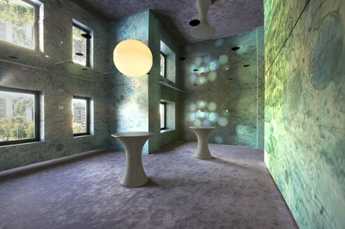
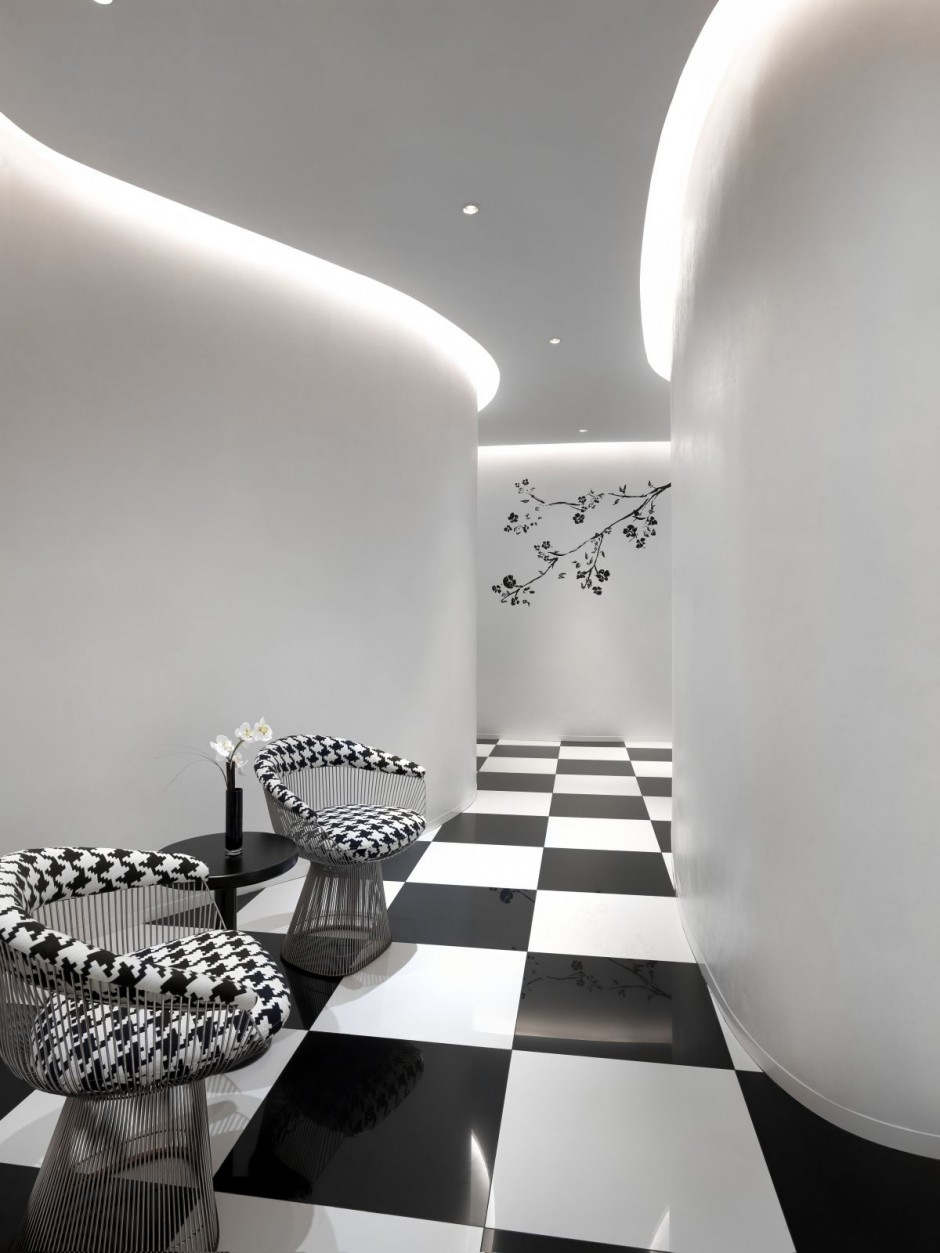
The office interior design has numerous work zones surround the atrium, designed to house 100 employees each in adaptable neighborhoods. An arterial staircase links the zones forming a ‘Meeting Tree’, emblematic of the interconnectedness of Macquarie’s client relationships. The Main Street on Level 1 offers communal spaces that are highly conducive to corporate and philanthropic events and includes a café and dining areas. Within the office floors ‘Plazas’ were modeled after collaboration typologies—the Dining Room, Garden, Tree House, Playroom, and Coffee House, where cross-pollination among business groups is encouraged through spontaneous encounters.
One Shelley Street has been designed to the highest levels of green star or LEED efficiency, using revolutionary technologies like harbor water cooling, chilled beams and zone controlled lighting. Overall energy consumption has been reduced by 50%. The interior staircase, linking the various neighborhoods, has reduced the use of the elevators by 50%. There has been a 78% reduction in paper storage needs and a 53% reduction in printing paper. Mail is scanned and distributed electronically, decreasing the need for storage. Employees have lockers in which to store personal addenda, and are deterred from creating paper waste, there's not a trash can in sight. The business benefit of ABW is the elimination of ‘churn’—the cost of moving groups and redefining spaces. Investing now meant savings in the future and Macquarie is providing an unmatched quality of life for its employees—benefiting clients, investors, shareholders and the environment.
By October 2009 nearly all of the 3,000 employees had moved into the new building. Although activity-based work environments are not yet the norm, the acceptance level among Macquarie employees has soared beyond initial anticipation. Nearly 55% change their workspaces each day, and 77% are in favor of the freedom to do so. There has been an abandonment of stale business practices that are traditionally incubators of complacency. One Shelley Street is positioned to be a trailblazer for the new global sustainable office building.


More images of the office interior at Clive Wilkinson Architects

Office Interior | DTAC Headquarters | Bangkok, Thailand | Hassel

HASSELL designed the new workplace for dtac, one of Thailand’s leading telecommunication providers, to accommodate 3,500 staff occupying 62,000 sqm over 20 floors. The dtac corporate philosophy of ‘play and learn’ is communicated through all their advertising and merchandising, and is also successfully reflected in the interior design of this new workplace, challenging conventional notions of arrival, meeting, concentration and relaxation spaces.To support dtac’s varied promotional activities, an extensive three-level open front-of-house the office interior linked by a new internal feature stairway provides a highly adaptable space, able to host a wide variety of client and staff events. With the office interior defined as volumes rather than by function, the rich and varied use of local timbers used for the flooring, screening and ceiling battens provide direction and framework across this activity-based workplace. The team-based environments created by HASSELL encourages dtac staff to be mobile and creative in their choice of work space; whether that is at their workpoint, within a meeting lounge or on the open terrace overlooking Bangkok’s skyline. The incorporation of a dedicated relaxation and fitness floor supplemented with indoor plants into the workplace further enhance staff amenity and promotes a healthy work environment.

Moreof this office interior at Hassel

Office Interior | RF | Shibuyaku hiro-o, Tokyo | October / Ueda and Nakagawa Architects

An office interior design for a creative corporation (an advertising agency). In order to make a freestanding dynamic & thin partition possible, all parts are constructed by the 30mm-thick steel flush. All furniture except office-chairs is made also in the thickness.
year: 2004-2004
type: office interior
location: Shibuyaku hiro-o, Tokyo
floor: 1floor
structure: steel
total floor area: 135.62m2
More of the office interior at October / Ueda and Nakagawa Architects

October / Ueda and Nakagawa Architects is an architect's office in Tokyo, Japan.